2024
Noted.
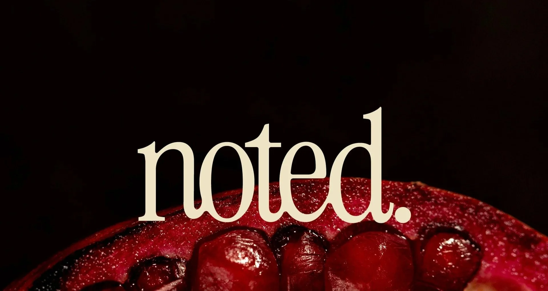
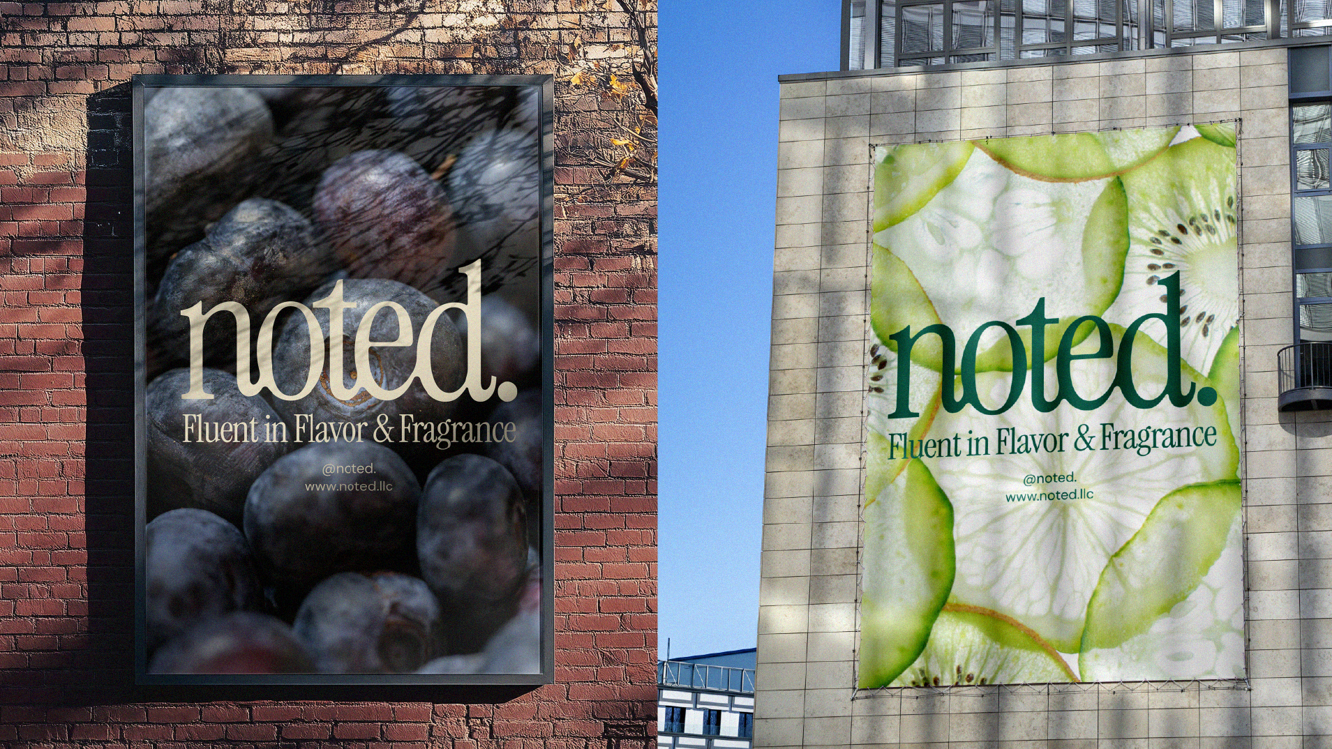
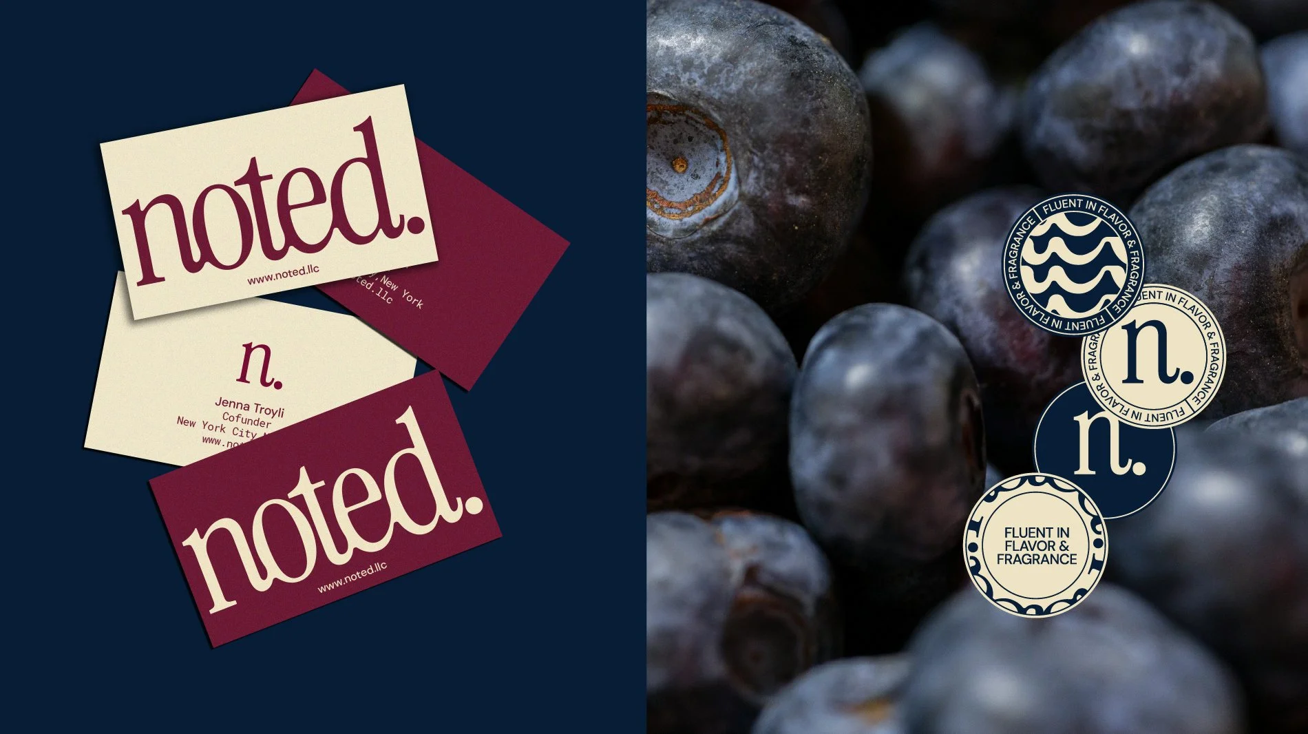
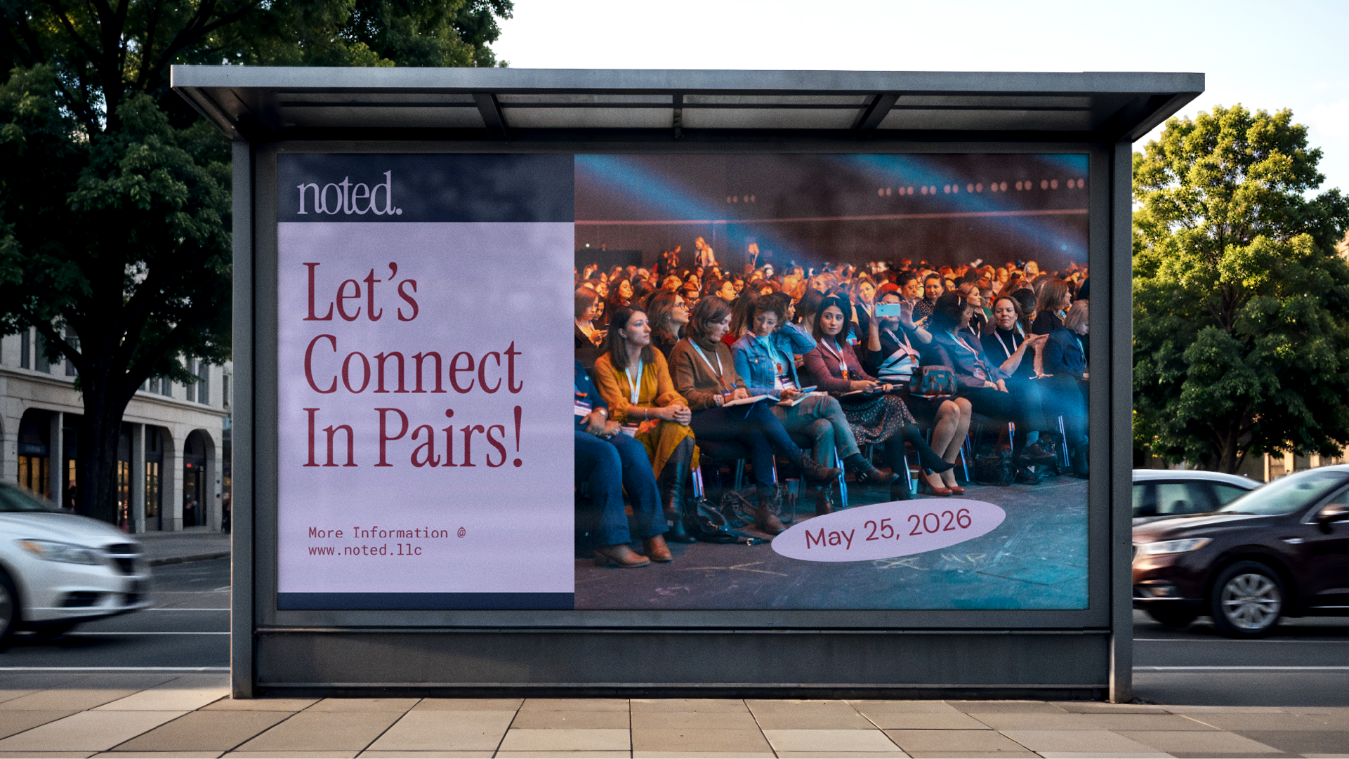
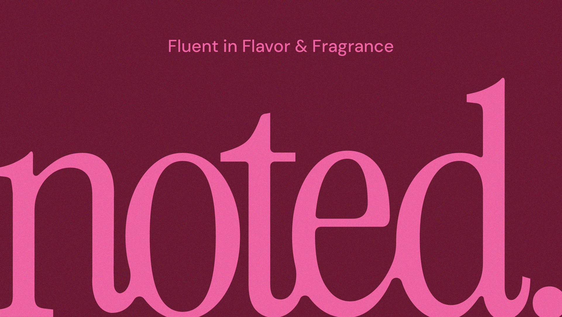
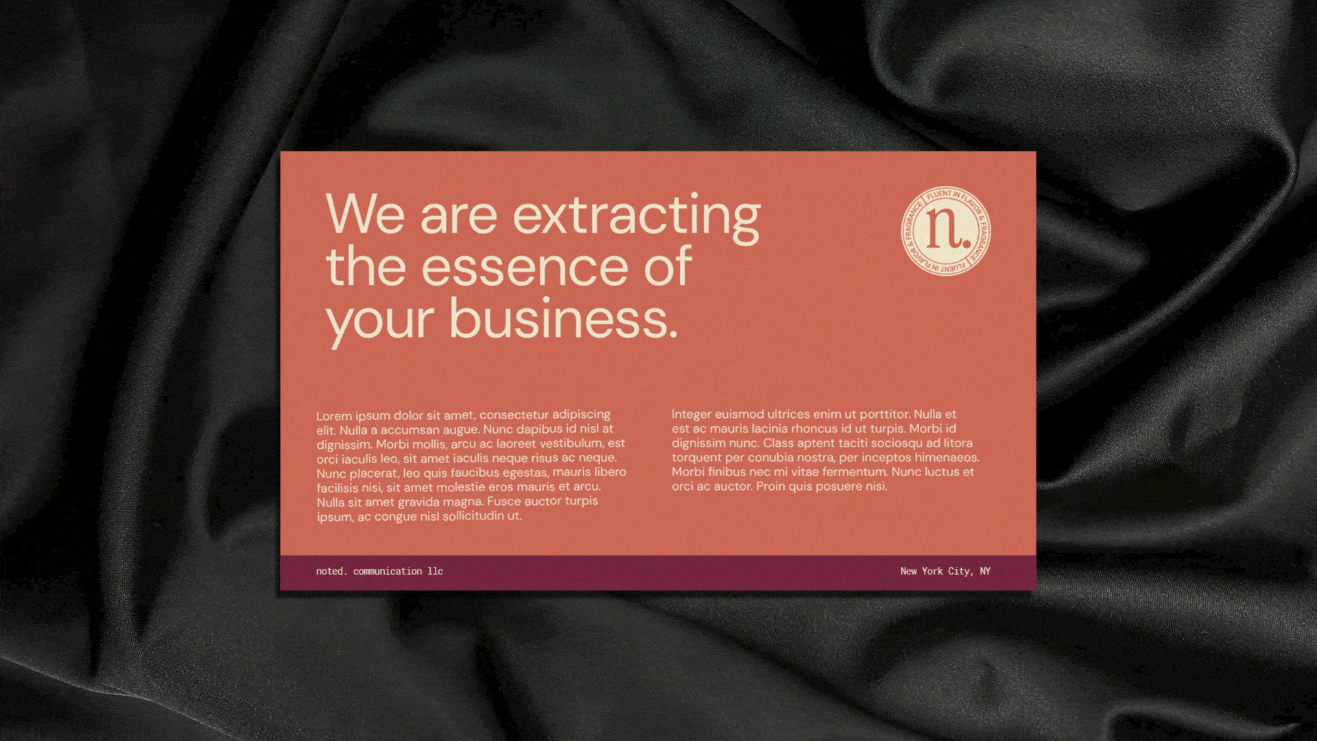
The Noted. brand identity was designed to capture a sense of connection and sincerity within the flavor and fragrance world. Guided by values of honesty, loyalty, and authenticity, the process focused on creating a visual language that feels both elevated and deeply personal. The custom serif logo reflects fluidity and conversation, while the typographic pairing introduces balance between softness and structure, mirroring how the brand communicates with warmth and confidence.
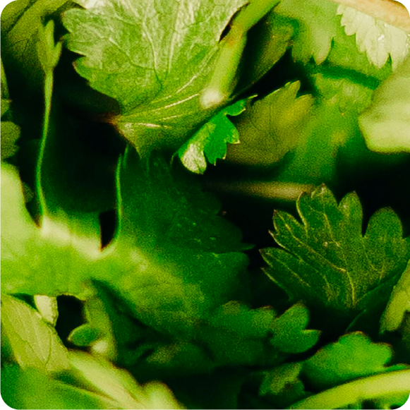
The visual direction emerged from exploring how color, texture, and rhythm could express emotion. Rich, grounded tones meet light, airy hues to evoke intimacy and openness, while close-up imagery invites viewers to experience the tactile beauty of detail. Together, these elements create a brand system that feels human, graceful, and unmistakably genuine, one that speaks to connection as much as it does to design.The visual direction emerged from exploring how color, texture, and rhythm could express emotion. Rich, grounded tones meet light, airy hues to evoke intimacy and openness, while close-up imagery invites viewers to experience the tactile beauty of detail. Together, these elements create a brand system that feels human, graceful, and unmistakably genuine, one that speaks to connection as much as it does to design.
Services
Branding | Visual Identity